18/05/23

Remember generative AI being a buzz-phrase in design in 2022? Us neither. It’s one of the biggest trends in UX/UI design for 2023, and the fact nobody was talking about it as a design trend last year just shows how quickly things change in the world of design.
Design trends are constantly evolving and developing, and it’s important to stay on top of those changes if you want to keep providing your users and customers the best possible experience. That’s especially true for UX/UI design, where the latest trends are dictated by a number of factors. These include things like changes in user behaviour and taste, but it’s also down to technological advances that allow you to do things digitally that couldn’t be done before.
To ensure your products and services are staying with the times and keeping your users satisfied, let’s take a look at the 10 biggest UX/UI design trends in 2023 to be aware of.
Generative AI
Generative AI is making an impact in all sorts of areas, with writers, mathematicians, coders and marketers all looking over their shoulders as ChatGPT and Bard show the world what they can do. In 2023, we’ve seen how it can also be applied to UX/UI design, with programmes like Galileo AI creating mockups, wireframes, illustrations and copy in seconds, all based on a brief text prompt.
Does that mean the end for designers? We don’t think so. What it does mean is it’s now quicker and easier than ever to generate wireframes and mockups to convey and validate ideas. While it is still no substitute for an experienced UX/UI designer, AI is certainly embedding itself into workflows.
Dark mode
“Give yourself to the Dark Side…”
It’s not just for powerful Sith lords. Dark mode is for everybody who wants to give their eyes a rest when using interfaces that are dense with text. With a well-organised design system, implementing a dark mode for text-heavy websites and applications has never been easier. It’s not only applicable for apps that require a lot of reading either. Other benefits of dark mode include:
- Saves battery: Because black pixels are turned off on our screens, it means the more black pixels there are the less power it takes a device to function.
- Looks stylish: There’s something aesthetically pleasing about switching from light mode to dark mode - it can make an interface look fresh, modern and sleek
- Accessibility: Dark mode can improve visibility in both low light conditions (less glare than light mode) and brightly lit conditions (better contrast). It can also help some users who have light sensitivity conditions, or cataracts for example.

No-code continues to thrive
No-code tools have been around for years now, but they have never been more powerful, intuitive, and user-friendly than they are today. With no-code platforms you can develop your UX/UI designs for apps and websites without needing to know how to write a single line of code.
You need to understand the limitations of a given tool, and they do have a learning curve. But the recent surge of interest from agencies and freelancers in using platforms like Webflow and Bubble is testament to the continuing growth of the no-code development movement.
Scrollytelling
What happens when you mix great storytelling with all the possibilities scrolling offers on modern interfaces? Scrollytelling.
Scrollytelling makes the most of trigger interactions, white space, and pacing to create a reading experience that is much more immersive and eye-catching than a traditional online article. It gives the reader a feeling of control and inclusion in the experience. Competition for attention online has never been fiercer, so scrollytelling done well can be a powerful way to capture an audience.

More video than ever
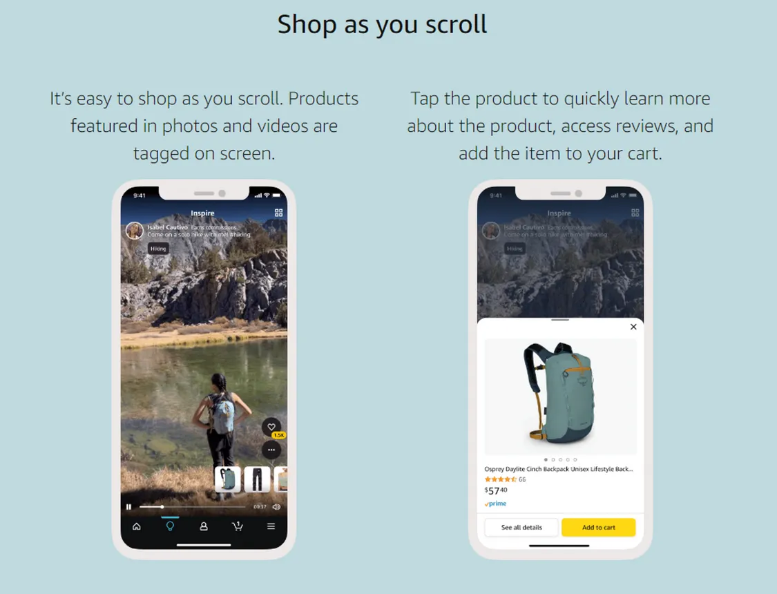
It might feel like video is everywhere already, but it's only going to become more ubiquitous. It was already a huge part of the user experience in social media platforms like Instagram and Snapchat. But now other types of tech companies are incorporating video clips into their platforms. Just this year Spotify announced ‘Clips’, short vertical videos artists can upload to further connect with listeners, while Amazon rolled out ‘Inspire’, to supplement shoppers’ experience with a TikTok-like feed.
Here’s a few reasons why video is an important trend for 2023:
- It stops the scroll: We are all spending more of our time on our phones, and an eye-catching, engaging video is a powerful way of grabbing a user’s attention for a few precious seconds.
- It’s the perfect storytelling medium: A good video can connect with viewers in a way still images cannot, and they can convey emotions, explain ideas, and showcase products in a compelling way.
- It’s viable: Video used to be a heavy burden on a device’s bandwidth and processing power. Not anymore. Modern devices and ever-faster internet speeds mean video can now be front and centre of more digital platforms without risking poor UX.
Creative error states and 404 pages
Errors happen, and whether your product or the user is at fault, it’s an important part of UX design to make sure a user doesn’t feel frustration when they encounter an error message. Even better if you can bring a smile to their face instead!
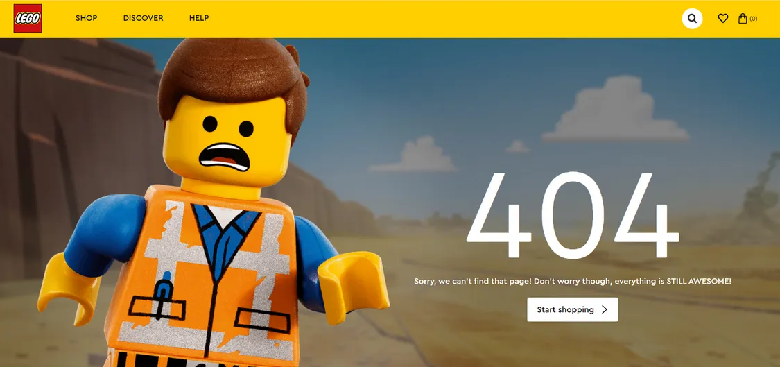
Having thoughtful UX writing for error messages can be the difference between a user persevering with your product, or jumping ship to a competitor. One way companies are increasingly trying to make the best out of a user finding themselves in a dead-end online, is through creative 404 pages (a page on a website that can’t be found or doesn’t exist). Take Lego’s masterful 404 page as an example. The image makes you smile, the copy keeps things positive, and the call to action directs you back to safety.
Voice user interfaces
Advances in AI are changing the digital landscape right now - and that applies to voice recognition too. Machine learning is making voice recognition models more accurate, allowing them to recognise more accents and understand speech in different contexts.
Users love being able to interact with their devices without having to type, tap, or even look at a screen, and AI is making that easier and cheaper to implement. Apple and Amazon have been rolling out updates to their voice interfaces Siri and Alexa this year, but thanks to AI, companies both big and small can now rely on the available technology to incorporate voice recognition in their services. Understanding how to design and incorporate voice interfaces is therefore becoming a more necessary design challenge for all sorts of companies in 2023.
One thing to bear in mind as we consider the top UX/UI trends of 2023 is just how fast the design landscape is changing thanks to technological advances, such as those highlighted in the area of AI.
Staying on top of the trends is vital for keeping up with, or getting ahead of, the competition, and giving users the experience they expect. We hope this article helps you to do that, and if you want to work with UX/UI designers at the top of their game, get in touch to chat about how we can help.


