18/05/23

There are many things to consider when designing a website for customers, but two things that cannot be overlooked are the user experience (UX) and the user journey. These can be fuzzy concepts to comprehend, so let’s look at an analogy.
You go to a restaurant you’ve been meaning to try, but when you turn up, they don’t seem to have a record of your reservation. After waiting 15 minutes at the bar, a table is ready for you - but when you sit down, you see it hasn’t been properly cleaned. You ask a waiter to wipe it down, and they are unapologetic. Then the service is slow. Your main dish is undercooked and has to be sent back. To top it all off, the payment consoles aren’t working, so you need to trek to the nearest ATM to get cash to pay for your meal.
Are you ever returning to that restaurant? Your customer journey was filled with obstruction and frustration, and the overall experience has left a sour taste in your mouth. A website may have fewer moving parts than a restaurant, but making sure the user journey and the overall experience leaves a customer satisfied is equally important if you want them to return.
What is UX and the user journey?
The UX of a website refers to the overall experience of using it. So that could be the steps the user takes to complete a task. It could be how long they have to search for what they want. It could be the colours used on the website imparting a feeling or emotion. The UX includes the user’s thoughts, feelings, and emotions throughout the interaction with the website.
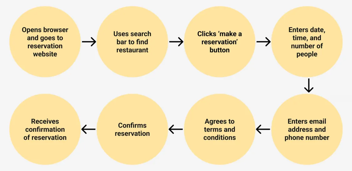
A user journey is a subset of UX, and understanding it is critical to ensure overall good UX. It is the specific steps a user goes through to complete their task or goal. Sticking with the restaurant theme, let’s look at a basic user journey on a restaurant booking website. Their journey might look like this:
- Open browser and go to reservation website
- Search for restaurant
- Enter date, time and number of people for the reservation
- Enter email address and phone number
- Agree to terms and conditions
- Confirm reservation

This is a simple example of a user journey, but if the website has been well designed for its users, it will have been designed with a good understanding of those users, and the journey they will take. While those steps look simple, there can be edge cases and wrong turns that need to be accounted for too.
What is so important about UX and the user journey?
As we’ve seen with our restaurant, a poor experience like that is going to end up with complaints, poor reviews, and customers not coming back. Plenty of websites suffer from this sort of UX. Good UX on the other hand, driven by a well-researched and understood user journey, will have the benefits of increasing satisfaction for customers.
If the user journey makes things easy and satisfies the user, there will be higher conversion rates, better brand awareness and reputation, and reduced abandoned purchases. That means more returning customers, better feedback and reviews, and ultimately, more business success.
So now we see the importance of a good UX driven by the user journey - but how do you find out what sort of user journey to implement on your website? That’s where research, visualisation, and iteration come in. Let’s take a look, step by step.
Conduct user research
Before you know what sort of journey to design for your users, you need to understand who they are and what they want. Here, data is your friend. If you already have analytics set up on your website, with a tool like Google Analytics for example, you’ll be able to track user behaviour and identify trends.
Hotjar is a tool you can use to get even deeper into the minutia of how your users behave on your site. It provides heat maps to show you where users are clicking and scrolling. You can get session recordings which show you how users interact with your site in real time - providing potentially crucial insight into areas where they are getting stuck or experiencing friction. It also gives you the chance to collect feedback from users with polls, which can also provide valuable insight on areas to improve.

UserTesting is another powerful tool that can provide insight into how real users are interacting with your website. It’s a usability testing platform that provides video feedback as well as written feedback, and you can use it to target your tests to specific users.
Finally, if you don’t yet have the users, or your analytics tools aren’t set up, you can conduct competitor research. Look for websites that offer a similar service to yours, and put yourself in the customer’s shoes as you go through their user journey. How have they designed the experience? What works and what doesn’t? Take screenshots or video recordings of the experience, and document the pros and cons of what you’ve seen. You competitors may have gone to great lengths to research their users, so this can provide you with a wealth of information quickly and cheaply - just don’t get caught up in copying too much from them. Your website and service is unique and different, and so are your users.
The goal of your research is to understand more about your users, specifically:
- Find out who your they are
- Identify their needs and pain points
- Identify usability issues
- Understand the journey they take on your website
- Get feedback from them on what works and what doesn’t
Visualise the user journey
Once you have a better idea of who your users are, what they want, and how they currently experience your website, you can visualise their journey through your website. There are a few options here.
User journey map
Make a visual representation of the steps a user takes to complete a task or achieve a goal on your website. This can help you to understand steps where friction might occur, and help you to focus on improving the UX.
User personas
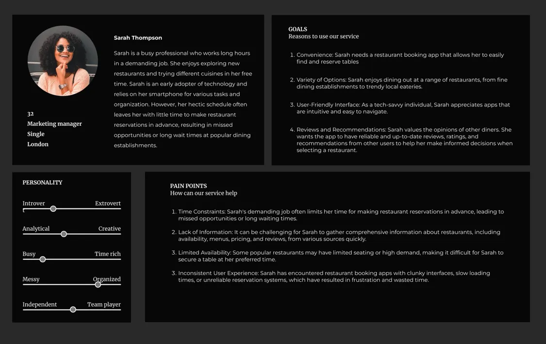
Creating some fictional personas for your customers can help you to design the journey with real users in mind. Using your research, create some user personas that represent the types of users you have, using information on their demographics, interests, and pain points.

Wireframes
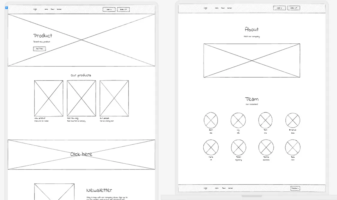
Now you’ve got a user journey visualised, along with your target user personas, you can map out how the user journey will actually take place on your website. Wireframes are quick and easy sketches of your website that you can make with design tools like Figma or Balsamiq, or even just with good old fashioned tools like pen and paper.
Sketch out your website design ensuring the user journey is being made easy at each step, before spending the time, effort and money making the changes for real. It can also be a great idea to test these sketches with users, to make sure the journey really is driving a good user experience.

Continuous improvement
So you’ve researched your users, visualised improved user journeys and UX on your website based on that research, and implemented the changes. Job done? Not quite!
No digital product or website is perfect. There’s always room for improvement, and as user behaviour and expectations are always subject to change, you need to keep working on this process of research, testing, and iteration. Good UX doesn’t stand still - it’s all about iteration.
With your new and improved user journey and user experience implemented into your website, it’s time to cycle back to your research and testing stage. Keep using analytics tools to gather up to date information on your users and how they interact with your site. If you see the user profile shifting significantly, create new personas to base your iterations on. Use all this information to draft new wireframes that improve the UX of the site, and test these wireframes. Then you can implement the changes, and rinse and repeat.
With a good understanding of your users and their journey on your website, you will be able to improve the UX, increase customer satisfaction, and reach business goals.


